Posts

Final Portfolio!

Image
As the semester comes to an end so does FMX 210. This semester we used four different Adobe Platforms: Dreamweaver, Illustrator, Photoshop and InDesign. Within all these programs we were given the creative liberty to design anything within the bounds of the project. To wrap up this class I created a Final Portfolio encompassing the work I am the proudest of. The theme I developed for the basis of my portfolio was pastel colors since they were so frequently used throughout all my projects. In the portfolio you will find the project itself along with a recollection of the project and how I feel about it. I hope you enjoy reading and looking through my portfolio as much as I do. This class has been so much fun, and I hope I am able to work with these Adobe projects again in the future!
Business Card

Image
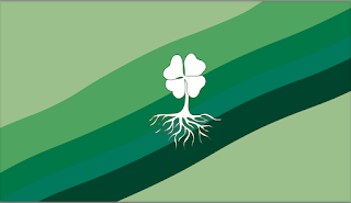
 Business Cards  ·         For my business cards I decided to stick to the color scheme of my original logos I created on Adobe Illustrator. I believe that business cards are very important because they represent my "company", very similar to how the logo represents me as a person. The business cards I created converts important personal contact information, but it also would be the first exposure that a customer sees of my "company", so it needs to be compelling. For my first business card I decided to keep the theme of the four-leaf clover and created a green ripple effect as the background and have my name in a fun font. For my second business card I wanted to create a more official business card look that looks more professional. I used grey and black colors to get the high-end look. For my final business card, I went for a more retro look. I included the same colors of the purple and the green in the original logo. I also included different png's to show wh

InDesign Tools for Beginners

 InDesign Tools for Beginners  How to Use Abode InDesign CC for Beginners|5 InDesign Tools You HAVE TO KNOW ABOUT I thought it was very interesting how unlike a Word document you are able to go outside of the margins and add whatever you would like wherever you would like. Overall the basic layout when it comes to text is very similar to what we have previously worked with in Photoshop and Illustrator. The tools on the left side of the screen also are very similar to the previous programs we have used as well. The video provided the basics on how to embed text within the page. The greater took a very long time to get to the point and since I have worked with similar programs the explanation of the tools and their purpose seemed very repetitive.  A to Z of In Design: Tips, Tricks and Hacks! | InDesign  Tutorial The clipping mask option is very interesting to me because it reminds me a lot pervious programs such as  Illustrator  and Photoshop. I really like dhow you could make a random s

Autoscopy

Image
 AUTOSCOPY The term autoscopy is derived from the Greek words "autos" (self) and "skopeo" (looking at). An autoscopy is a self-portrait with alternations to represent oneself or an experience. Within my autoscopy I included many space elements, specifically earth and different images of the galaxy. My final composition is composed of 4 images, my image, earth, a purple galaxy, and an orange galaxy. Each image has a hue/saturation alternation along with an opacity change. The inspiration for this piece came from an image where a galaxy was embedded into a woman’s face. This gave me the idea of incorporating space into my autoscopy. The first thing I did was isolate my face and body from the original image. From there I change the hue and saturation of myself. To add more detail to my face I then isolated my lips, changing them to a blue color. I wanted myself to have a cool saturation to represent Earth in a way. I then embedded a picture of the galaxy into the backg

Somewhere

Image
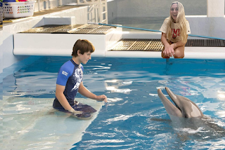
Somewhere-Dolphin Tale For my image I choose to put myself in one of my favorite childhood movies, Dolphin Tale. Winter's passing inspired me to photoshop myself into the movie and replace one of the main characters Hazel. Winter served as an inspiration as she learned to swim with a prosthetic tail after she was injured from a crab trap rope. Although Photoshop is not my favorite Adobe platform, I had a lot of fun with this project. After using all the methods we have been taught in class, everything started to come together. Overall, the hardest part of the whole project was including my tag brush on Sawyer's shirt.  Originally, I wanted to find a photo from the movie where more of the cast was in the photo however the images I found where not high enough resolution or displayed what I had in mind. I decided the photo with the three main chapters was very fitting for this project because it wasn't too busy and included all the aspects of the movie that I loved.  Modeling

Photoshop 2 Homework

Image
 Photoshop 2 Homework 1) I believe it would be very hard to photoshop myself into this image because of how dark the photo is and how they are all touching. Additionally, if you zoom into the photo there is a specific grain over the entire photo.  2)This image inspired me because I love the whimsical aura it gives off. This image was an instant mood booster for me so I would like to photoshop myself into a photo that would be a mood booster for other people. I also just love the overall look and colors of this image.  3)This photo made me laugh because people were asking for the boy in the background to be photoshopped out but the artist just zoomed in on the boy. No photoshop was done, the only thing that was done was zooming in and cropping.  4)I would like to create this illusion because of the simplicity of it. I think it is very inspiring that they used such an ugly background to produce such a beautiful photo. 

BW to Color

Image
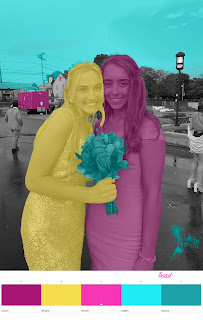
Black and White to Color                 For my Black and White to Color photos I decided to use a photo from my Senior Prom because I love the colors and the texture of our dresses. I converted the original photo to black and white within photoshop. From there the abode color wheel was utilized. I choose three color wheels that I thought would be represented very nicely within my photo- square, triad, and  complimentary. I added the colors I liked the most in the color wheel to be the most significant color. For example in the Triad image. I choose the make the bouquet blue because it stuck out so much within the outline of myself and my friend Elise.               Overall, I enjoyed doing this project because it allowed me to  preserve when I ran into trouble. I would have to say that this project took m over 2 hours just because I had a lot of difficulty getting started however once I figured out everything the final two images were very easy to produce. I am now much more comfortab