Business Card
Business Cards
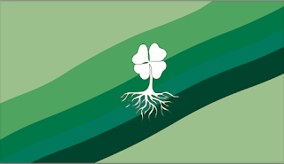
· For my business cards I decided to stick to the color scheme of my original logos I created on Adobe Illustrator. I believe that business cards are very important because they represent my "company", very similar to how the logo represents me as a person. The business cards I created converts important personal contact information, but it also would be the first exposure that a customer sees of my "company", so it needs to be compelling. For my first business card I decided to keep the theme of the four-leaf clover and created a green ripple effect as the background and have my name in a fun font. For my second business card I wanted to create a more official business card look that looks more professional. I used grey and black colors to get the high-end look. For my final business card, I went for a more retro look. I included the same colors of the purple and the green in the original logo. I also included different png's to show what each line of information meant. Overall, this project took me a total of 2 hours. I had a little bit of difficulty trying to come up with different ideas but other than that I did not have any trouble with this project in InDesign.
Business Card 1(front to back)
Business Card 2(front to back)
Business Card 3(front to back)


For the second design, I like that you just used the initials of your name instead of writing it out. Your logo is very well designed. Normally I'm not a fan of green, but the first one is very pleasing to look at.
ReplyDeleteThank you Lauren!
DeleteI really like your business cards. With every design, the colors and logo matched. The way you used your logo was my favorite part.
ReplyDelete