Propaganda Poster
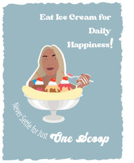
I used two main posters as my inspiration for creating my poster(inspirational photos attached below). I used a combination of each image I found online to create my poster. I used the banana split image from one poster and then I used the idea od the lady eating the ice cream with her hand from the other poster. Using both poster I them crafted my poster to fit the style I wanted to have. To get the 50’s style fonts I used dafont.com unde the style “groovy”. Overall I am very pleased with how my Propaganda Poster came out, it is simplistic enough to get the point across but has enough detail that it does not go unnoticed. In all it took about 4 hours to create this poster. I had a lot of difficulty creating my selfie to gte it to the point where I liked it enough to use in my poster. I really enjoyed created the ice cream and the hand. I would definitely do this project again because I had a lot of fun expressing myself in this way. The only thing I would change about the poster is making it fit the 50’s theme a bit more by adding a grain texture over the entire poster to make it look a little bit for dated. However, overall I really liked how my Eat More Ice Cream Propaganda Poster came out!

Super good execution of your propoganda poster, I especially like the ice cream. This poster definetly makes me want to go get some ice cream. The blue background in very inviting and comliments the skin tones inyour portrait.
ReplyDeleteThank you Joe! I glad my poster makes you want to go get some ice cream!
ReplyDeleteI love this poster a lot, I think you really pulled off the retro vibe you were going for and I think its super cute!
ReplyDelete