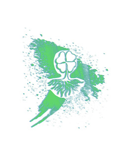
Logo Tag Brush
For this assignment the Black and White Logo I created in Abode Illustrator was edited in Adobe Photoshop to mimic a Graffiti Tag Brush. Essentially I turned the logo into a brush stroke through a series of techniques. Within this new brush the colors of blue and green where chosen to represent my logo. Keeping in mind that the logo originally created was supposed to represent us I decided to keep Blue and Green within the color scheme of my Tag Brush because the meaning behind those colors very well represent me.
To start off, using an 8.5 by 11 new canvas my four leaf clover logo was embedded and its size was adjusted using COMMAND T. Then the logo was whole was outlines using the Polygonal Lasso tool. From there the layers and paths of the logo were manipulated. One the Tag Brush was to the desired look based on texture size and placement of the textures the image was saved as a brush stroke. Using the newly created brush stroke the brush was placed down and its color was changed. On the final Logo created Green and Blue were layered over each other so that each color was visible.
I really enjoy the look of my logo. I like the imperfections of the logo and how it is so unique. Even though everyone essentially used the same textures in this project, no two logos look the same. The grunge of the logo is different from anything I have ever done before because it is not a style I would typically use. Creating this tag brush took a little over an hour, however this brush was created following the directions of Professor Roundtree which helped enormously!


Comments
Post a Comment